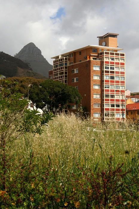
And while I'm on the subject of things I love about Cape Town...
South Africa has an amazing collection of ugly architecture. Some of my favorite examples of this are the kitsch brick apartment-blocks that sit below Lion's Head, crowding against the promenade in Sea Point.

4 comments:
Thank you for your interest in architecture. This is a good example of what appears at first glance to be a well designed building thou I do not find it an extremely attractive or beautiful object. My tastes differ but I very much am interested in, enlightened and respect your opinion.
Would like to see more of what
interests you. My contact at
toonisbureaut@msn.com. I am a specialist on fair and attraction
architecture, a general futurist and architectural historian, and would like to know more about the construction in your region. A world fair in South Africa sounds inspiring and I would be interested in contributing to a pavilion on lions.
BRIAN M.
Been looking around at a few of your other interests. You are quite young - only 24. You have
a great enthusiam for nature and interesting built things. I am sure that I can show you alot of interesting images. I have been creating and exploring such for many years, my 53rd birthday is
on the 19th of January 2008. I am a
graphics specialist and I urge you to explore the visual and sensory arts for you will surely be rewarded.
The doorway in Los Angeles is something I full well appreciate -
when I was a little younger than you I saw a similiar detail in the work of Antonio Gaudi in Barcelona. Simple doors often are indicators of a great more about a design. In suburban St. Laurent Montreal Canada the doors on many houses particularly old Alexis Nihon indicate that alot of experimentation was going on in this community where split levels originated. The Montreal underground city and Expo 67 were results of such bold and innovative thinking.
Generally there are two schools - the conservatives who cling to more
classic solutions and old sometimes European models and what I call the Montreal Expo school, who are not afraid to drive design beyond barriers and explore new avenues or approaches.
The Polish pavilion with its cut out facade proposed for Shanghai Expo 2010 is perhaps one good example of this.
There are some interesting buildings at Expo 2008 Zarasgoza
as well. Have a look at that.
I wouldn't call the building ugly... there is something beautiful about kitschy architecture. Having said that, you might say the same thing about buildings I would describe as an eyesore here in Vancouver.
Again, know that I love this blog. One of the most beautiful I visit.
Ahhh Cape Town! It certainly has an appeal. I am hoping to get there for the Design Indaba in February!
You have a talent for making us "see" things we would otherwise just have passed by!
Post a Comment