
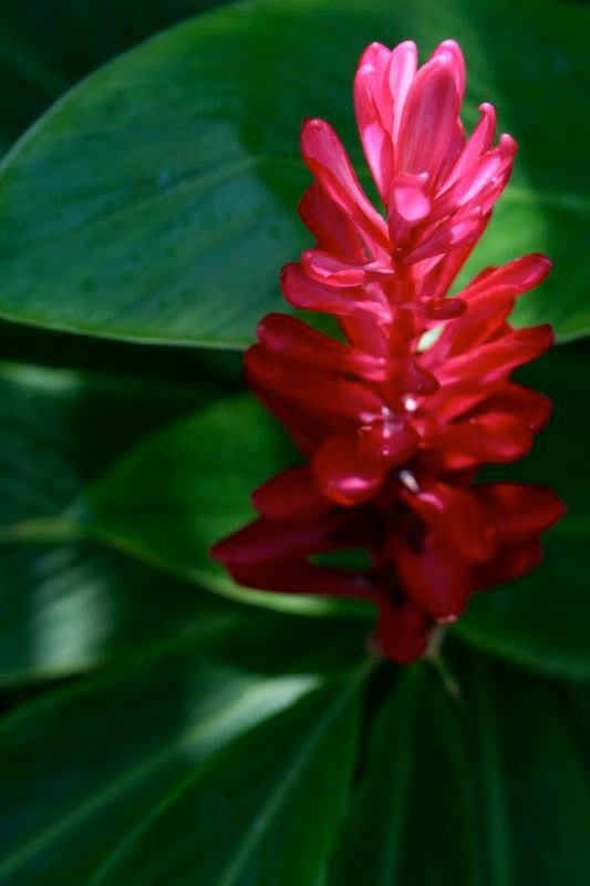
For my color series I usually isolate one color that defined a place for me, but the color scheme of Bali was a little too complex for that tactic. So much of the beauty of Bali was in its carefully balanced opposites; the good and evil in its religious epics, the beautiful and the grotesque in its temple architecture, the fire of a sambal and the cool bite of lime in its food. So in its colors too, it makes sense, there was a balance; between the heat of bursts of pink, orange and red, and the relief of deep green.


5 comments:
I'm so jealous... I've never been and I'm dying to go!
love the idea of chosing one color scheme that represents a destination!! one for bali you chose absolutely right, it must pink and green!
viele grüsse, kristina
Very nice Dud !
I am Syed Tahir from Pakistan . I am also fond of culture photographs . see my blog and please give me some tips to expand it .
http://pakijobsinf.blogspot.com/
Oh my gosh, I love the reds and the greens of these photos. Again, you=talented.
Nice pics of Reds and greens ...superb...indeed talented...
Post a Comment